

ROLE
UX DESIGNER
UX RESEARCHER
DURATION
MAY 2022 - AUG 2022
MANAGER
JON TINMAN
MENTOR
RAMSEY BEYER
BOUNTEOUS
Overview
During my internship at Bounteous, I worked with the Peoni team to deliver design flows, components, wireframes, and prototypes for their client MedImpact. Peoni is a part of MedImpact and provides affordable health care coverage to small businesses.
The launched marketing site can be viewed at HTTPS://PEONIHEALTH.COM/.
Tools Used
Figma, FigJam, Miro, Confluence
PEONI PLANS
Peoni makes purchasing and managing employee coverage simple by offering a suite of fully integrated services with their level-funded health plans. With so many options, picking the right coverage can be tricky, so it was important that our team was able to make the experience simple, easy, and informative.
CHALLENGES:
01. How do we make confusing and complicated coverage plans digestible and easy to compare?
02. How do we take different users with varying levels of insurance knowledge into account?
03. What information should be prioritized the most to compare the plans at a glance?
[FIG 01]
REVIEWING CLIENT-PROVIDED RESOURCES
The client-provided resources I had to work with were based on a number of files branched out across different platforms. These documents were also often full of discrepancies, as our client was still sorting out critical aspects of their product. In addition, we were also working on deliverables without user testing.
With these constraints, we were largely learning about the product as we go.
The first thing I had to do was understand what needed to be translated, what these plans meant, and what they consisted of. That meant spending a lot of time through dozens of files. This posed a challenge because of how much contradicting information there was.
Once I familiarized myself with these resources, I was able to have a greater understanding of the requirements, to the point where I could categorize the plans and understand the nuances.
[FIG 02]
SITEMAP
Based on those findings, I worked with another designer to put together the initial site map. This way we were able to have a more visual understanding of how to organize and partition the flow. We were also able to establish clear objectives and actions we needed to take. As time went on, requirements and content changed, so this structure had some updates.
AFTER
We realized that the parent page still might not allow the user to have enough of an understanding to advance. For the user who needs to see quantitative information to truly understand the differences between each plan, we decided to include another page, which would provide a more thorough comparison. We also noticed that there wasn’t enough information and differences for the Essential plans to create individual places.
BEFORE
Initially, we planned on structuring the site so that the user would go straight from the parent page to general overview pages of the highest tier of plans. We also considered making individual detail pages for the second tier of Essential Plans.
[FIG 03]
SOLUTION
Following our initial discoveries and ideation, our goal was to make learning about and comparing their various health coverage solutions simple by providing multiple paths of discovery for different users.
[FIG 04]
INITIAL ITERATIONS
Throughout my internship, I was responsible for designing this flow where different users may choose different paths with varying amount of information. As a result, I created the wireframes for the parent page, all plans list page, plans comparison table pages, and plans details pages. During this time, I also shared daily updates with the internal team and our clients. Based on their feedback and our collaborative discussions, I made adjustments to ensure alignment on our goals.
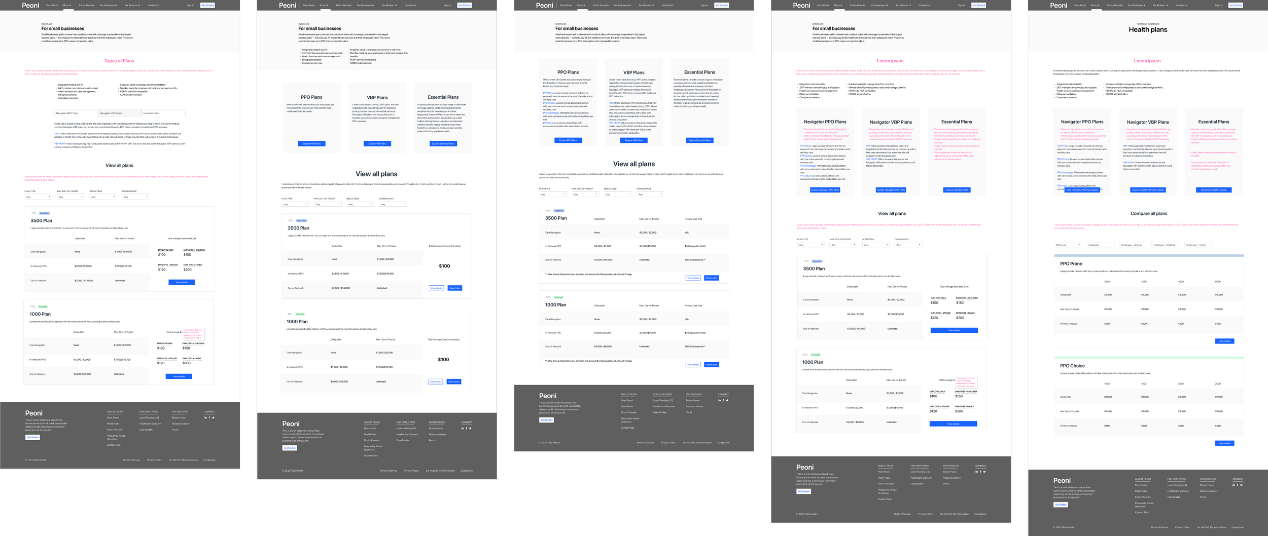
01. PARENT PAGE

02. FULL PLANS LIST PAGE

03. COMPARISON TABLE PAGE

04. PLANS DETAIL PAGE
[FIG 05]
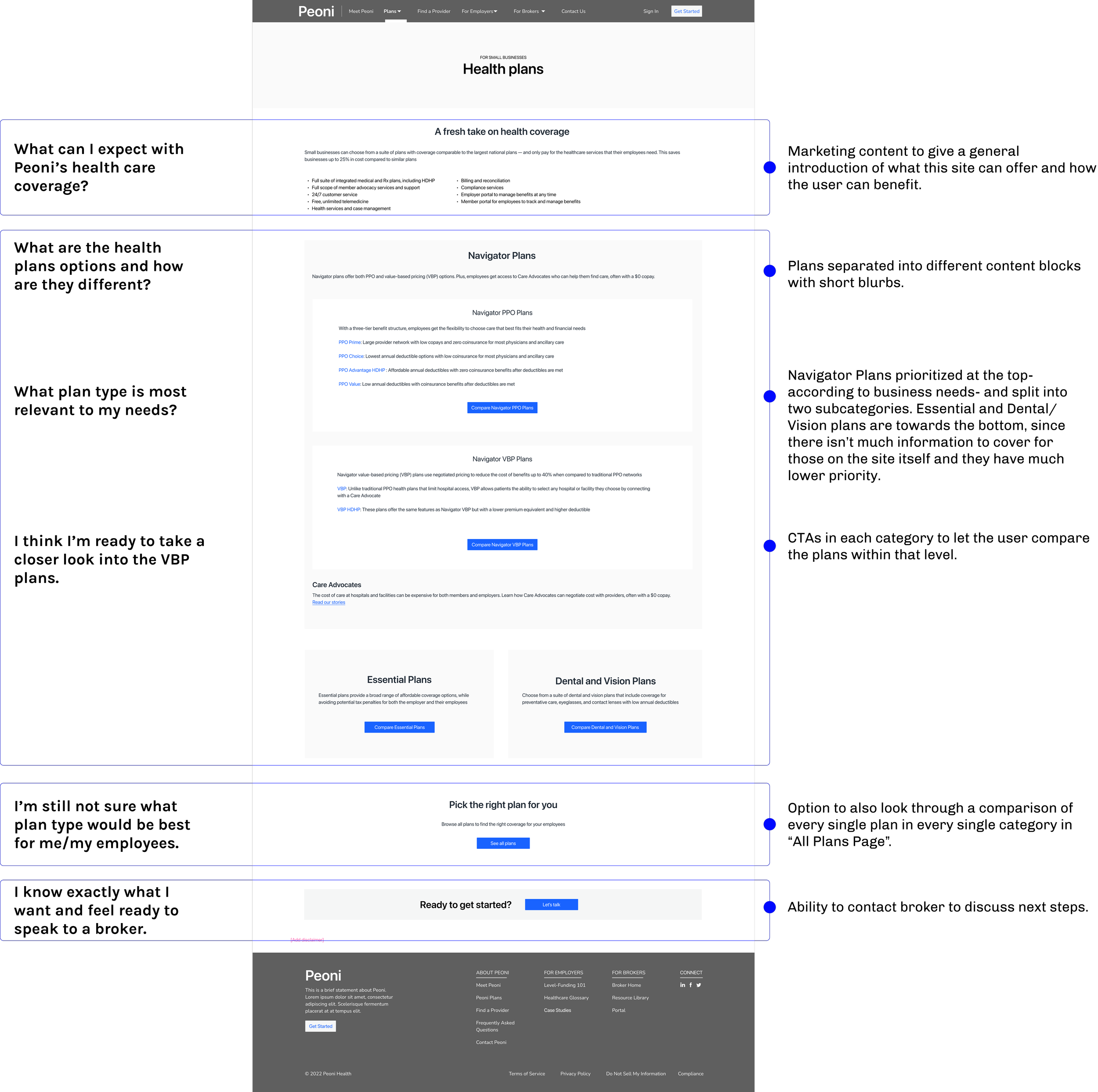
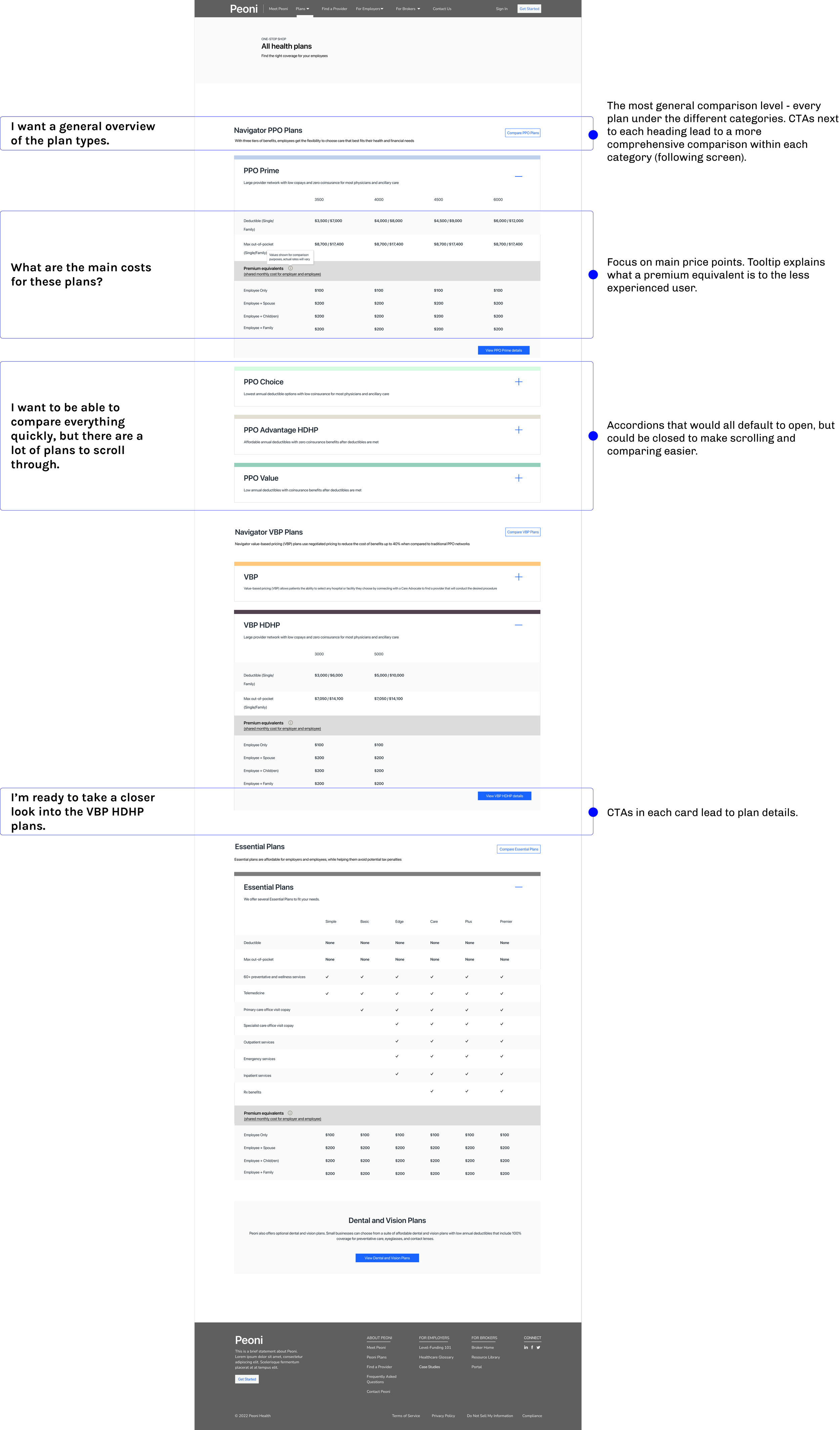
FINAL ITERATIONS
All pages and their elements are designed to follow the thought process of an employer or employee browsing the site.


[FIG 06]
LAUNCHED SCREENS
The marketing site with the plans flow can be viewed at HTTPS://PEONIHEALTH.COM/.
PROPOSALS PORTAL
With the plans wrapped up on the UX side, I shifted gears to the employer proposal package flow. Here, the employer receives an email and text message from a Peoni broker with a link to the employer portal. On this portal, the employer can view proposed plans to offer their employees, and reject or deny the proposal.
TASKS:
01. Designing the sign in process
02. Iterating the landing pages for different user states
[FIG 07]
SIGN IN
I wireframed the sign in process, displaying every action the user can take at this point in the flow.

01. SIGN IN

02. OTP FILLED

03. OTP ERROR

04. CONTACT SUPPORT MODAL

05. RESEND OTP MODAL
[FIG 08]
LANDING - INITIAL ITERATIONS
As our client was still internally determining constraints and technicalities to share with us, there were still a number of open questions that needed to be answered before we could commit to a single solution. I explored different possibilities of displaying the proposal package. I created wireframes depending on all possibilities of the some questions left to be determined, including:
01. Are proposal packages separated according to different plan tiers, or can different plan tiers be grouped into the same proposal package?
02. Can an employer receive multiple proposals at once?
03. Can an employer accept multiple proposals?
04. At what point in the process can the employer review the required documents to upload? (Before accepting the proposal, or after?)
[FIG 09]
FINAL INTERATIONS
Following some more discussions with the client, we were able to gain more clarity on the process and requirements. At our alignment, I finalized the landing page to the screens below.
KEY FEATURES:
01. Progress bar to indicate what phase the current employer is at
02. Large “Download Proposal & Rate Sheet” CTA at each phase for reference
03. Description of next steps after completing current phase to confirm completion and keep users informed
04. Ability to automatically accept proposal after submitting all documents in Phase 2 to minimize number of clicks, steps, and screens
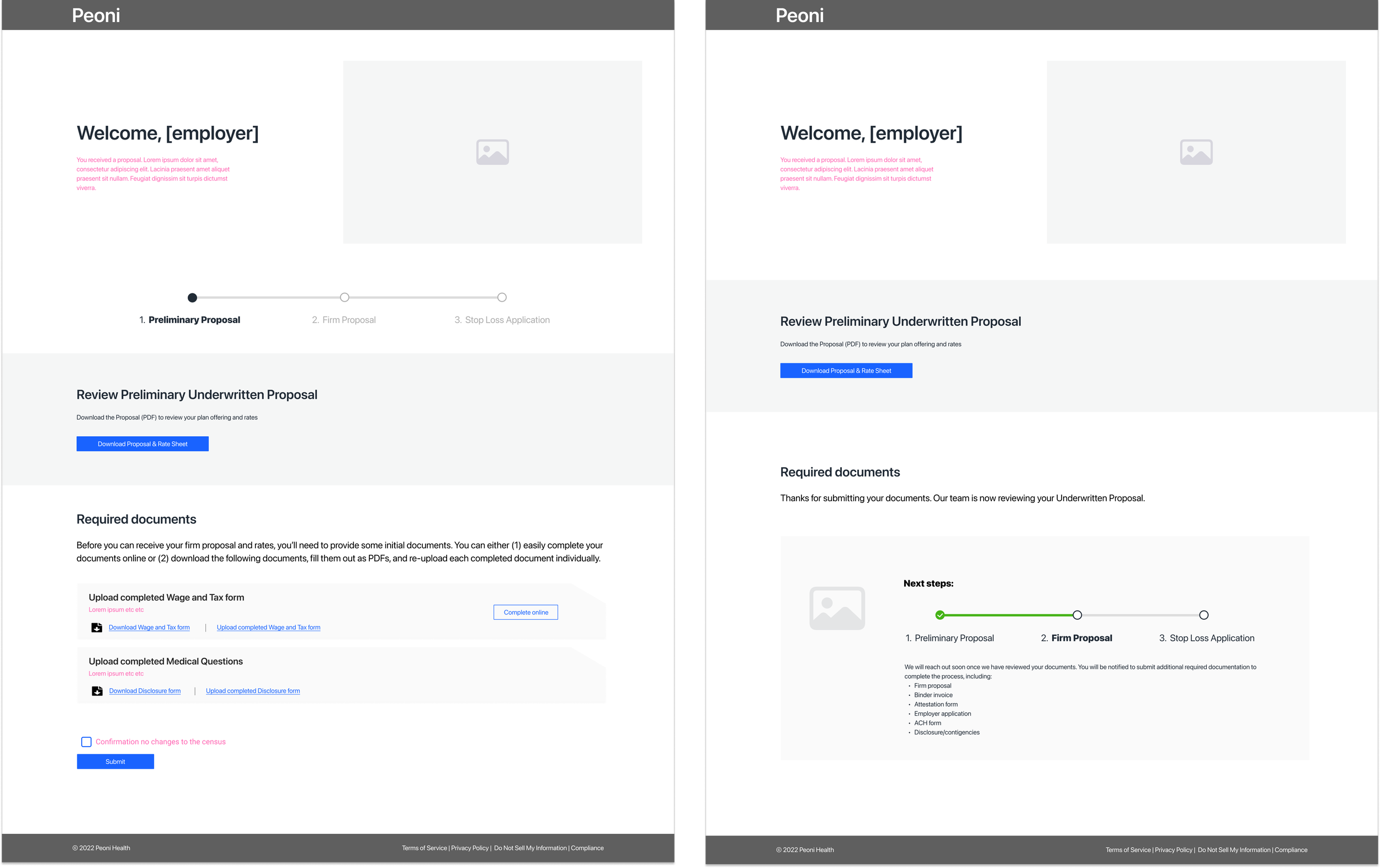
01. PHASE 1
Employer fills out preliminary information to receive proposals.

02. PHASE 2
Employers can upload all newly requested documents at once to automatically accept the proposal.
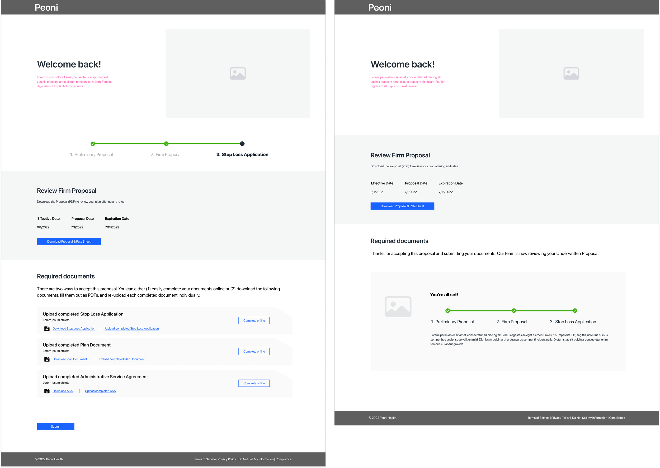
03. PHASE 3
Once documents from phase 2 have been reviewed, employers will open the portal again to upload the stop loss application.
REFLECTION
Working at Bounteous positively impacted my growth both professionally and personally.
This experience has shown me a really UX mature organization as a whole, and one that fully embraces the people and customer first.
Being able to work in an environment with really respectable people that I can look up to, attending meetings and events that I can look forward to, feeling like my opinions and decisions matter, and feeling super comfortable about sharing concerns that I have really makes a difference in motivation. And all those things have really made work fun and interesting for me.
I especially appreciated Jon Tinman, my direct manager, who managed to ease me into a challenging project in an unfamiliar field, as well as Ramsey Beyer, who was my closest collaborator and fully supportive of my growth.