

ROLE
UX/UI DESIGNER
UX RESEARCHER
DURATION
JAN 2022 - MAY 2022
MANAGER
LEAH HERMAN
ACI WORLDWIDE
Overview
During my internship at ACI Worldwide, I worked under the UX design team. As the company had just revamped its design system, my core theme throughout my time here involved translating legacy style guides to a new modernized look. As an intern, I implemented new features, redesigns, and flows.
Tools Used
Figma, FigJam, Miro, Optimal Workshop, Usability Hub, Confluence
V C A
OFFER APPLICATION
ACI’s Virtual Collection Agent’s users include customers with outstanding balances. Through the site, users can make payments, speak with a representative, and receive billing notifications. Most importantly, users can be matched with collection offers, but must first fill out the offer application. As efforts were initially focused on simply reskinning legacy systems, internal ACI teams uncovered underlying issues with the effectiveness of their user experiences.
CHALLENGES:
01. How do we reskin the UI to make the site look more consumer-friendly?
02. How do we make the application process more intuitive?
03. How do we balance what needs to be reskinned versus redesigned?
[FIG 01]
CURRENT STATE (VCA BEFORE REDESIGN)
My first tasks was to begin working on the new and improved version of the existing offer application, as pictured below.
[FIG 02]
ITERATIONS
As I worked alongside product managers, developers, and the senior designer, there were different opinions regarding how the offer application should be translated on its revamp. The product managers favored a simple reskin for the sake of the developers’ time and effort. On the other hand, the senior designer had ideas on restructuring the organization.
I created different iterations of how we could approach it, demoed the prototypes to the team, and shared the pros and cons of each design that I had found.
After sharing my designs and thoughts, our team unanimously agreed on Iteration 3, as we believed it was the best compromise between the reskin versus redesign debate by maintaining the look and structure of the existing site and improving its functionality.
V C A
LOGIN
As the team and I continued with modernizing VCA’s UI, we realized that certain existing features and actions weren’t compatible with our vision for the new UI. I looped back to the login screen to figure out the best way to display supplementary information.
[FIG 03]
CURRENT STATE (VCA BEFORE REDESIGN)
In the original and existing site, clicking a crosslink appears to only update the content of the right card, although it actually directs a user to a new page.
[FIG 04]
REDESIGNED LANDING
Based on the layout of the new landing page created by the senior designer, I was responsible for figuring out the treatment of the login page’s crosslinks.
The basis of my iterations
[FIG 05]
ITERATIONS
Taking these points into consideration, we landed on Iteration 04 since it provided enough content space and affords more flexibility with client changes. Although it is a stark change from the landing page, it is still visually consistent with other redesigned ACI desktop and mobile consumer screens.
C S I 2
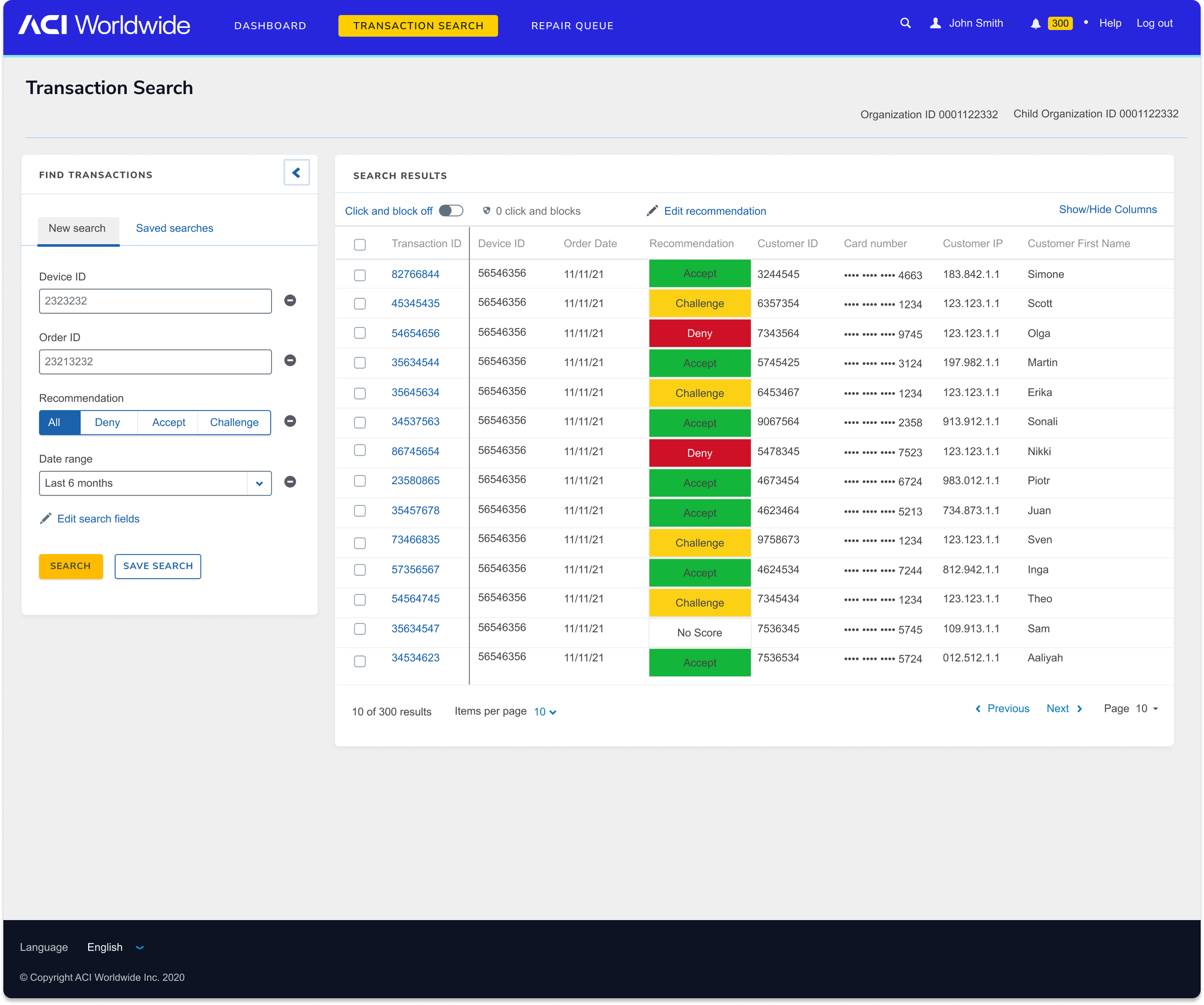
CLICK + BLOCK
I also worked on redesigning ACI’s CSI into CSI 2. CSI 2’s click and block feature allows ACI’s internal risk analysts, as well as risk analysts from ACI’s clients, to manually select suspicious transactions and flag them from going through the payment system.
CHALLENGES:
01. How do we make CSI 2 a more comprehensive tool?
02. How do we make clients feel more comfortable using the portal themselves?
[FIG 06]
USABILITY TESTING + FEEDBACK
I conducted synchronous remote usability testing with 6 participants alongside the senior designer. The participants included 4 internal ACI risk analysts and 2 clients.
[FIG 07]
FINAL SCREENS
I moved on to working on the click and block screens with our previous findings in mind. After rounds of iterations, I concluded with the following screens and design decisions.
KEY FEATURES
01. Progress bar to clearly indicate what step the user is at
02. Summary screen before confirming new rules
03. Accordion menu that defaults to open, in case one pane may not be relevant or too lengthy to scroll through
04. A clearer “click and block” button
05. “Current recommendation” to compare with “future recommendation” in review screen


To see the “click and block” screens in action, take a look here

C S I 2
STRATEGY MANAGER
The CSI 2 portal also allows risk analysts to use workflow automation features such as strategies, lists, features, and rules to automatically flag suspicious transactions. Currently, the users employ multiple tools in conjunction with CSI 2.
CHALLENGES:
01. How do we make CSI 2 a more comprehensive tool?
02. How do we make clients feel more comfortable using the portal themselves?
[FIG 08]
USER INTERVIEWS
By the time I had joined the project, the redesigned CSI2’s demo site had been live for a few months. Before doing any hands-on design work, I assisted the senior designer with interviewing risk analysts who were familiar with both the redesign and the old version. Our questions mainly focused on:
01. Their level of comfort using the new design
02. If they prefer the old design versus the new design
03. How often certain features are used
04. What steps they take to manage fraud
[FIG 09]
AFFINITY MAPPING
After gathering user insights, I took note of all our findings on virtual sticky notes. I consolidated these notes, categorized them, and organized it by synthesizing information. Information we worked with included surveys, user interviews, and user testing.
01. Overall negative reception towards the new format for rules - takes too long to create rules, too confusing to find and interpret rules
02. Action sets are underutilized and misunderstood by half of ACI risk analyst participants. Templates were also mentioned to be useful, but not used within the interface. Clients don’t normally use rule manager (all key features of CSI 2)
03. Risk analysts typically use rule manager everyday, but using different parts of the system depends on the amount of data
TAKEAWAYS:
[FIG 10]
FINAL SCREENS
In an effort to make creating rules, lists, and features easier for the users, I worked on simplifying CSI2’s wizard / Strategy Manager. I minimized the amount of clicks a risk analyst would make by combining steps into a single and fluid process, such as giving them the option to make rules, lists, and features all at once.
REFLECTION
When I first joined ACI Worldwide, I was told that the company was going through large UX changes that were to be handled by a small UX team. While I felt prepared in knowing this, I definitely learned a lot during my first experience in the financial software field.
I appreciate how from day 1, I was treated as the equivalent of a full time employee rather than an intern. I was able to participate in UX research, UI/UX design, and stakeholder meetings. It was an eye-opening experience of how to better work on my craft and refining and training those skills.