

FOOD PLANET
Overview
Our team was assigned with designing an app for the social impact sector. Many of us had started to be more conscious about ethical shopping, but we noticed that there was a lack of regard for the food industry when discussing conscious consumerism. Most applications regarding careful consumption of food also revolved around dieting rather than ethics. We decided to design Food Planet, a food brand rating platform that informs users of brands that align with their values.
Our team consisted of a project leader, project manager, financial researcher, and two UX designers. My original role during the course of this project was the market researcher. However, I took initiative to work on this app design further after the class’s conclusion as a personal project.
Role
Market Researcher, UX/UI Designer, UX Researcher
Tools Used
Figma
Duration
Mar 2021 - May 2021
PROBLEM ⚠️
Ethical shopping decisions are difficult to make because most consumers are not fully aware of the practices that businesses take part in, yet the number of consumers who want to shop with purpose is rising.
[FIG 01]
RESEARCH METHODS
[FIG 02]
LITERATURE REVIEW
A report from WEBER SHANDWICK surveyed 2,000 U.S. and British consumers who had taken action in response to what a company or brand did. The survey found that 83% said that it was more important than ever to support companies they believe “do the right thing” and buy from them, compared with 59% who said that it was more important to participate in a consumer boycott. Unique mobile environments can also visually and mentally engage users in sustainable consumption education through nontraditional forms of interaction, encouraging learning and involvement. Thanks in large part to social media, sustainability has now hit the mainstream consciousness. Leading the movement are members of Generation Z and Millennials. 9 in 10 Generation Z consumers believe companies have a responsibility to address environmental and social issues.
[FIG 03]
COMPETITIVE ANALYSIS
The initial research that I gathered provided insight into basic consumer habits and attitudes toward ethical shopping. However, I wanted to gain a better understanding of existing design patterns and features. I noticed that apps on the market engage its users in a way that is fun or visually interesting, encourage and motivate users to take action, and explain the criteria of their rating.
[FIG 04]
SOLUTION 💡
Food Planet rates popular food brands based on their ethical choices to make shopping easy and enjoyable. The app encourages good consumer habits by allowing its users to reflect on their shopping decisions with its rating feature.

[FIG 05]
LO-FI WIREFRAMES
As I was still the market researcher at this point, I did not play a hands-on role in these wireframes.
For the first prototype, the initial UX designers organized the features that we brainstormed together as a team. Here, users are able to view different brands and view brief descriptions and criteria breakdowns. They are also able to search for specific brands, save their favorites, and view articles.
This was the delivered prototype at the end of our class.

[FIG 06]
USABILITY TESTING → Proceeding solo
However, I felt that there was greater potential for the design of our app. One of the first issues that I had noticed was the overemphasis of the news content. On top of that, the information was too fragmented and the navigation was confusing. I worried that this would cause the user to get lost from constantly switching between screens. I also felt that there was a lack of personalization for users who had different needs and frustrations.
At the conclusion of our class, I decided to continue working on the UX design alone with the initial prototype created by the past two UX designers as the basis. I ran a usability test with 3 conscious consumers, ranging from ages 18 to 25 to understand what else could be improved.
01. Unclear hierarchy - Participants felt that information was too overlapped and lacked a clear hierarchy.
02. Unappealing visual design - Participants felt that the design was underwhelming and unintuitive.
03. Lack of affordances - Participants weren’t clear on what actions they were able to do.
TAKEAWAYS:
[FIG 07]
HI-FI WIREFRAMES
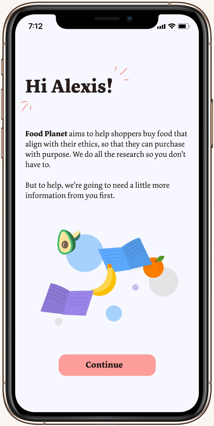
02. ONBOARDING
During the onboarding process, the user is prompted to pick their top values and concerns when shopping. After doing so, the user is met with a loading screen that shows a brief glimpse of how the app's decisions are made to keep users informed and maintain their interest.
04. PROFILE + NEWS
The user profile displays all of their favorite brands and values, which they are also able to add to. Account and app settings may be viewed by clicking the hamburger menu at the top right. The news page also gives up-to-date information to keep users informed.

01. LOGIN + SIGN UP
Logging in and signing up is usually a one-time process, so it's important to make a good first impression. A playful and engaging launch screen is added to improve visual communication to the user.

03. FINDING FRIENDLY BRANDS
I added a more simplified bottom navigation in comparison to the initial prototype. Rather than making the home screen news-related, users can immediately browse through brands. All relevant details of the brain including its practices can be viewed on the brand's page. Users also have the option to save specific brands and find their products nearby.

[FIG 08]
INTERACTIVE PROTOTYPE
[FIG 09]
FINAL USABILITY TESTING
With the goals I had for this iteration in mind, I conducted user feedback sessions with 5 users who had different attitudes towards conscious consumerism, ranging from apathy to enthusiasm. The general overview of each session consisted of the following steps:
01. Provide participants with a description of the app concept.
02. Walkthrough users along benchmark tasks one by one.
03. After each task, ask participants for input on what went well and what didn't.
However, 2 main concerns were brought up as I gathered feedback from the users. My initial impression of the first prototype, as mentioned earlier, was that there was a lack of addressing the needs of different users. To work around that, I added the feature for users to add their different ethical values. My focus in doing so caused me to overlook other differences in users, such as their dietary needs or financial limitations. In addition, users felt that there was a lack of incentive within the app. Retention and conscious consumerism may be encouraged with a sort of reward system or progress tracking. As one user put it,
“It’s almost a little too idealistic to think that spoon-feeding people information is enough to make them care.”
— ANONYMOUS USER 👤
REFLECTION
Because this class project was much more focused on business management in technological organizations rather than the UX design process, our team’s original UX designers weren’t able to dedicate much user research or design techniques to really tailor the app to our target audience. Nevertheless, I was able to work with some imaginative minds who thought to approach the social impact sector creatively.
I really enjoyed working on this project further. I had fun working with playful interfaces, and I’m glad I was able to create a more fleshed-out, deliverable product of what I thought was a really interesting idea created by my team.
If I were to continue working on this project in the future, I would definitely include the ability to add dietary restrictions during the onboarding process, since many people practice certain diets due to their religions and moral values. Financial limitations are also one of the largest reasons that people are unable to have access to ethical food products. Because I want this app to encourage users of all backgrounds to have the same affordances, I would include different price filters within the main menu as well as price range descriptions on specific brand pages (similar to Yelp). As for adding incentive, one idea I have is to give users the option to input their purchases, which would prompt the app to show a positive message. I’d also have to figure out a way for users to see how their purchases have physical impacts, continuing to use the positive reinforcement approach.